Dot Site

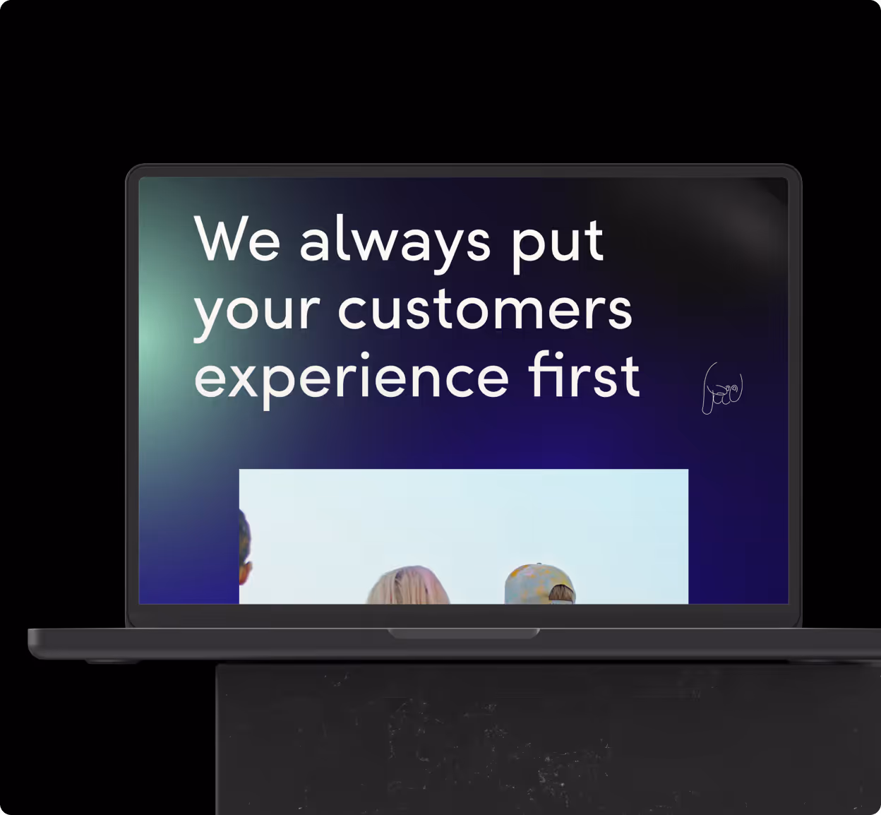
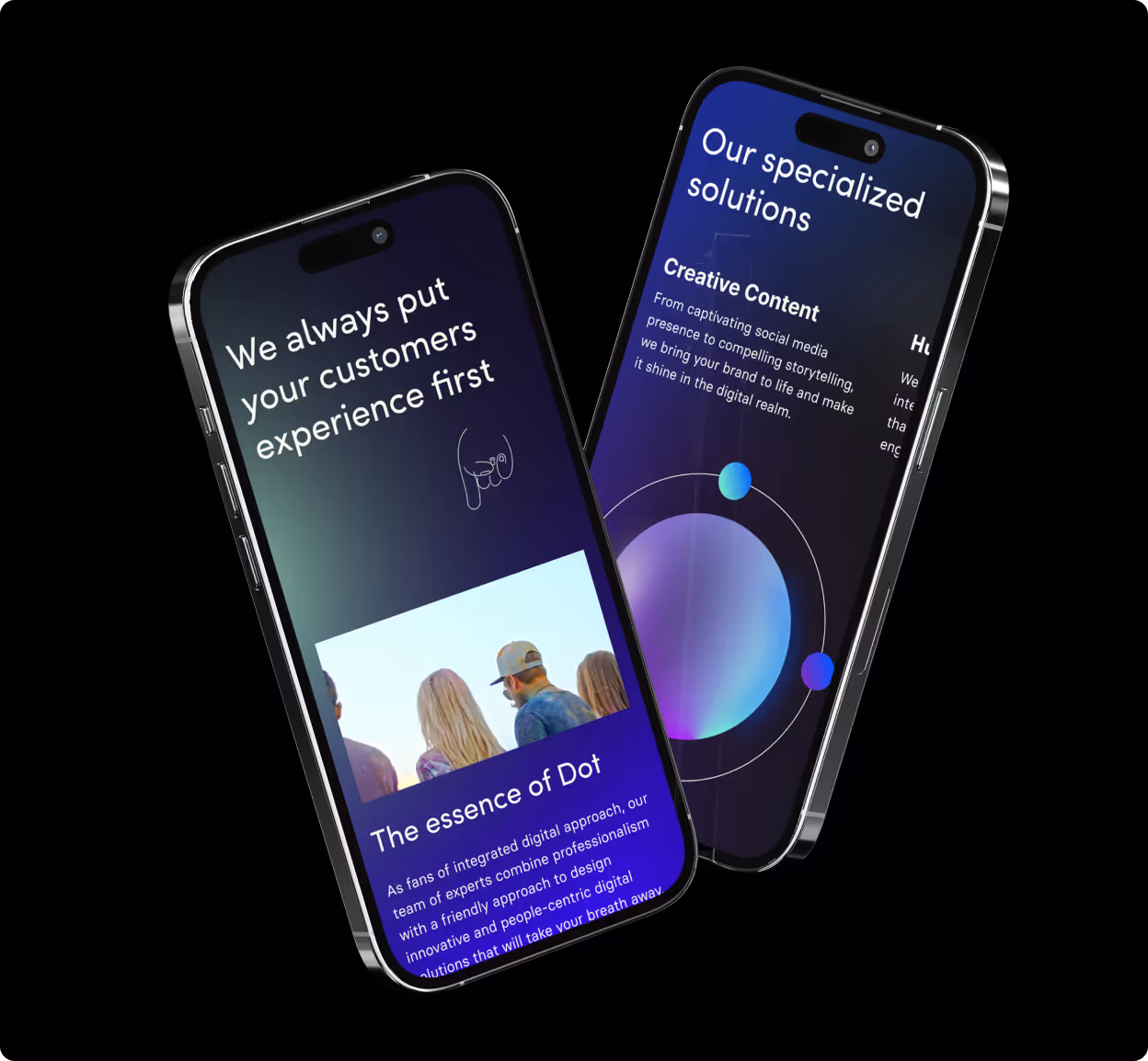
User-centered design is the secret weapon behind creative agencies’ websites. It’s not just about how good something looks it’s about whether it actually works and delivers an experience that truly wows people. A truly powerful website isn’t just stunning; it’s something visitors can’t get enough of easy to navigate, and simply impressive.

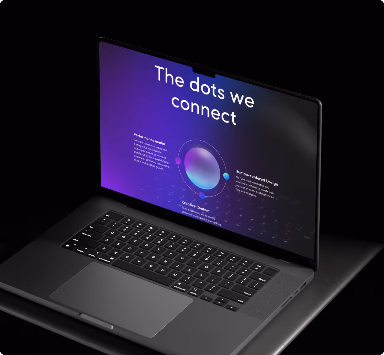
We crafted a design that’s not just cool, but genuinely functional. This platform not only showcases our agency’s unique style but also makes it crystal clear that we mean business.

Dot Site Case Study - home page on desktopDot Site Case Study - on mobileDot Site Case Study - Services on desktop
Details

Problem

The existing website lacked clarity, structure, and visual hierarchy, making it difficult for users to understand the offering.

Solution

We developed a clean, structured interface with improved navigation, stronger visual hierarchy, and a design aligned with the brand identity.

Process

- UX audit
- Wireframing
- UI design
- Iteration and refinement

Results

The new design improved usability, increased time on site, and created a stronger first impression for potential clients.

The structured layout and clear messaging support higher conversion potential.

Contact

Stay connected

hello@studiooffgrid.com